In today’s data-driven business environment, presentations are no longer just about sharing information. They are about communicating insights in a clear, engaging, and memorable way. Whether you are presenting sales figures, marketing performance, financial reports, or project updates, the way you visualize your data can significantly impact how your audience understands and responds to your message.
Professional charts help transform complex numbers into meaningful visuals that are easy to interpret. However, creating effective charts requires more than simply entering data into a spreadsheet. It involves choosing the right chart type, maintaining clarity, and presenting information in a visually appealing format.
Understand Your Audience
Before creating any chart, consider who will be viewing your presentation. Different audiences have different needs and levels of expertise.
For example:
- Executives often prefer high-level summaries and key insights.
- Managers may need detailed performance metrics.
- Team members might require operational data and trend analysis.
Understanding your audience allows you to select the most relevant data and present it in a format that supports decision-making.
Choose the Right Chart Type
One of the most common mistakes in business presentations is using the wrong chart type. Different charts serve different purposes.
Bar Charts
Bar charts are ideal for comparing values across categories. They work well for displaying sales by region, revenue by department, or customer satisfaction scores.
Line Charts
Line charts are excellent for showing trends over time. They can effectively illustrate monthly revenue growth, website traffic, or performance improvements.
Pie Charts
Pie charts are useful when you need to show how individual categories contribute to a whole. For instance, they can display market share, budget allocation, or customer demographics.
When creating proportional data visualizations, using a reliable pie chart maker can simplify the design process and help produce polished, professional-looking charts that are easy for audiences to understand.
Scatter Plots
Scatter plots are useful for identifying relationships between variables and analyzing patterns within datasets.
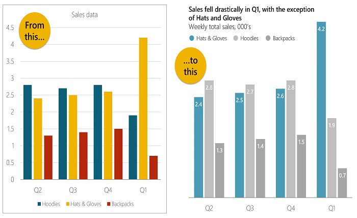
Keep Your Design Simple
A professional chart should communicate information quickly. Overly complicated visuals can confuse your audience and distract from the key message.
Follow these design principles:
- Limit unnecessary colors.
- Avoid excessive labels.
- Remove distracting backgrounds.
- Focus on one key message per chart.
- Use readable fonts and font sizes.
Remember that simplicity often improves comprehension.
Highlight Key Insights
Business presentations should tell a story rather than simply display data. Your audience should immediately understand the most important takeaway from each chart.
Consider highlighting:
- Significant growth trends
- Revenue increases
- Performance improvements
- Cost reductions
- Market opportunities
Using callouts, annotations, or subtle emphasis can direct attention to the most critical information without overwhelming viewers.
Use Consistent Formatting
Consistency creates a polished and professional appearance throughout your presentation.
Maintain consistency in:
- Font styles
- Font sizes
- Color schemes
- Label placement
- Chart dimensions
If every chart follows the same visual style, your presentation will appear more organized and easier to follow.
Select Colors Strategically
Color plays an important role in data visualization. It helps distinguish categories and emphasize important information.
Best practices include:
- Using brand colors when appropriate.
- Limiting the number of colors used.
- Applying contrasting colors for comparisons.
- Using neutral colors for secondary information.
Avoid overly bright or distracting color combinations that can make charts difficult to read.
Focus on Data Accuracy
Even the most attractive chart loses value if the underlying data is inaccurate.
Before presenting:
- Verify calculations.
- Check data sources.
- Confirm percentages and totals.
- Review labels and legends.
- Ensure dates and figures are current.
Accurate data builds credibility and supports informed decision-making.
Reduce Visual Clutter
Too much information can make charts difficult to interpret.
To improve readability:
- Remove unnecessary gridlines.
- Simplify legends.
- Avoid excessive data points.
- Use whitespace effectively.
- Display only the most relevant information.
Clean and uncluttered charts allow audiences to absorb information more quickly.
Incorporate Visual Hierarchy
Visual hierarchy helps viewers understand where to focus first.
You can establish hierarchy by:
- Increasing the size of important elements.
- Using bold labels.
- Applying stronger colors to key data.
- Positioning critical information prominently.
A clear hierarchy guides the audience through your chart naturally.
Ensure Mobile and Screen Readability
Business presentations are often viewed on laptops, projectors, tablets, and mobile devices. Charts should remain clear regardless of screen size.
To improve readability:
- Use large text labels.
- Avoid overcrowding.
- Test presentations on multiple devices.
- Ensure sufficient contrast between text and background.
This ensures your audience can easily interpret the information in any setting.
Tell a Story with Your Data
The most effective business presentations combine data visualization with storytelling.
Instead of presenting numbers alone, explain:
- What happened
- Why it happened
- Why it matters
- What action should be taken
A compelling narrative transforms data into actionable insights that resonate with decision-makers.
Use Modern Visualization Tools
Today’s visualization tools offer features that make chart creation faster and more efficient. Modern solutions provide customizable templates, interactive design options, and professional formatting capabilities that help users create presentation-ready visuals without extensive design experience.
Choosing the right tools can save time while improving the overall quality of your charts and presentations.
Review Before Presenting
Before delivering your presentation, conduct a final review of every chart.
Ask yourself:
- Is the chart easy to understand?
- Does it support the presentation’s objective?
- Are labels accurate?
- Is the design professional?
- Can viewers identify the key takeaway within seconds?
A thorough review helps eliminate mistakes and strengthens your presentation.
Conclusion
Professional charts are essential for effective business communication. They simplify complex information, improve audience engagement, and support better decision-making. By selecting the appropriate chart type, maintaining a clean design, highlighting key insights, and ensuring data accuracy, you can create visualizations that enhance the impact of your presentations.
Whether you are presenting to executives, clients, investors, or team members, well-designed charts help transform raw data into meaningful stories that drive understanding and action.